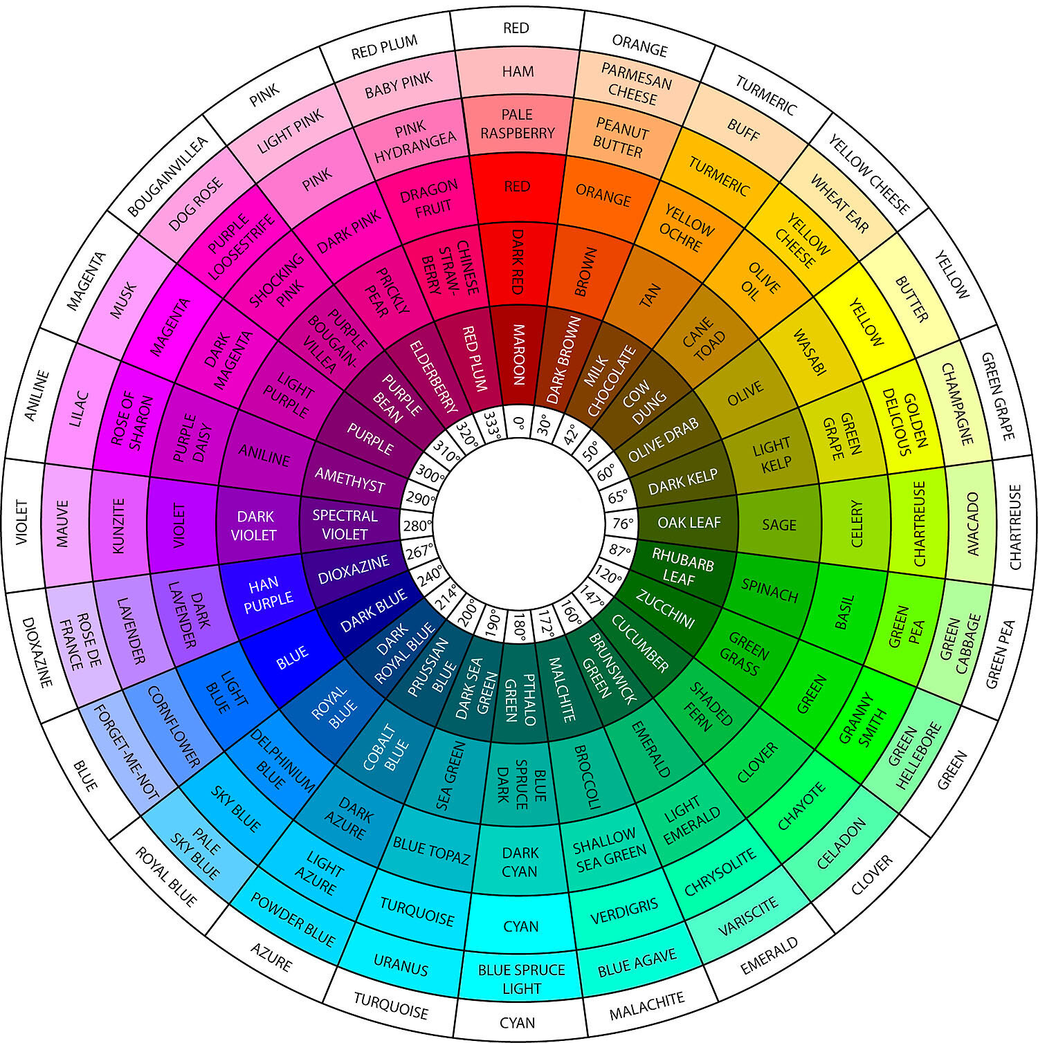
Harmony is a pleasing arrangement of different elements. Colour harmonies are those that create visual interest and a sense of order. Colour harmonies create balance. There are eight colour harmonies - analogous, monochromatic, complementary, near-complementary, split complementary, tetradic, triadic and polychromatic.
ANALOGOUS - Analogous colours are those that are found next to each other on the colour wheel. This colour harmony is often replicated in nature and is visually pleasing to the viewer. An effective analogous colour harmony would be to select a dominant colour and choose a supporting or accent colour next to it on the colour wheel. This colour harmony reflects low contrast.
MONOCHROMATIC - A Monochromatic colour harmony is a particular colour including all of its tints, shades and tones, Monochromatic colour creates a very delicate, low contrast, visual effect. The hue stays the same and white, black or grey is added to the colour, reducing colour saturation and luminosity. It is a subtle, minimalist and refined colour harmony.
COMPLEMENTARY - A complementary colour harmony reflects colours that are directly opposite each other in the colour wheel. This colour harmony has high contrast and is effective when you want an element in an image/design to stand out, however, it can become visually displeasing to the eye if the effect is overdone.
NEAR COMPLEMENTARY - A near complementary colour harmony is a two-colour combination. The colours are found opposite each other on the colour wheel and either one step to the left or right of the opposing colour. This is also referred to as a Counterpoint Colour Scheme. If one of the colours used is dominant, the colours will enhance each other when positioned together.
SPLIT COMPLEMENTARY - A Split Complementary colour harmony is made up of three colours. On picking the first colour, you go to the complementary colour opposite in the colour wheel and choose the colours located on either side of that. The harmony always creates strong visual interest and has less tension than a complementary colour harmony.
TETRADIC - The Tetradic colour harmony is represented by four colours, found as complementary pairs on the colour wheel. As warm and cool colours will always feature in an image/design using this colour harmony, it is important to pay attention to balance of colour temperature. This particular colour harmony is most pleasing to the eye when one colour is dominant.
TRIADIC - A Triadic colour harmony is represented by three colours that are positioned at equal distances to each other on the colour wheel. Successful images/designs using this colour harmony will require one colour to dominate, using the other two colours in a supporting role. The Triadic colour harmonies are always vibrant combinations of colour with medium levels of contrast.
POLYCHROMATIC - A Polychromatic colour harmony is where five or more colours are included. This colour harmony works when colours with the same tint, tone or shade are used and can be taken from anywhere on the colour wheel. The Polychromatic colour harmony reflects medium levels of contrast.
Colour is capable of setting moods of warmth and tranquility, attracting attention, creating a focal point, creating a sense of elegance or calmness, affecting us not only visually but emotionally and physically as well. Understanding colour and being able to use colours consciously and harmoniously will create spectacular results. The eight colour harmonies are traditionally, colour combinations that are pleasing to the eye and we must always remember that attracting the viewers eye is of the utmost importance.
I hope that you found this blog useful and I recommend that you get yourself a Pocket Colour Wheel from the local art shop and have it sitting on your desk ready for when you next edit an image.
